Tag Archives: perspective

From On High… An Idea (25/365)

So I was pretty high up on a climb on Kid Goat (Blue Bubble) when it occurred to me it’s really hard to capture a real sense of how it feels to be up that high above the valley floor in a photograph.

IMG_4223

A vista like this sort of conveys scale (those are tall trees down there, and they don’t look very big). But what is harder to capture is the sense of vertigo when you are actually directly above stuff, like when you are at a hanging belay on the side of a cliff…

IMG_4221.JPG

So, I took a bunch of reference photos and what I think I’ll try to do is a drawing or painting that exaggerates certain elements of the composition to try to better reflect the feeling of being up there…

IMG_4188.JPG

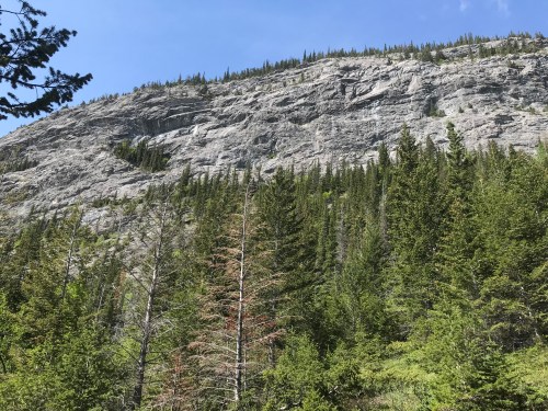
Here’s a view of the climb from below, from the approach trail.

Dad has been very helpful, sending me examples of work by people like Sonja Delaunay and Andre Derain, who both used exaggerated colour and perspective to get their point across.


andre derain 1904 baker-s-hotel

Baker’s Hotel by Andre Derain, 1904


sonia delaunay three-women-dressed-simultaneously.jpg!Large

Three Women Dressed Simultaneously by Sonia Delaunay

And then I found this one, also by Sonia…


sonia delaunay 1967 color-rhythm-1967.jpg!Large

Color Rhythm by Sonia Delaunay, 1967

Which was a bit odd, because I’d been playing with colour blocks in my notebook just moments before I found her work after following a link sent by Dad…

IMG_4286.jpg

My blocks are a lot less solid than hers (pastels on textured paper rather than oil paints in Delaunay’s…). And my palette is totally different, of course… but on that front I was inspired by Josef Albers, about whom you will hear more in the days to come as Dad and I have had several Albers conversations and, weirdly enough, he is also featured in a current issue of an art magazine (which I stumbled across online and have now lost again… I’ll retrace my steps and try to post a link when I get back to Albers properly…)

It has been another busy day and I need to go find some grub, have a shower, and takeĀ another look at the scenes we’ll be rehearsing tomorrow for the Canmore Summer Theatre Festival’s production of Romeo and Juliet. My creative cup runneth over!!


Dots, Lines and 3D (13/365)

FullSizeRender 2

Back to Basics: Red Dot, Green Line (pen and gouache)

Yesterday I left off with the thought that if lines and circles were a bit much to handle, perhaps I should have a better look at the good old dot.

Then Dad sent me this…

IMG_3222

Pause, by Bridget Riley (1964)

Oh boy. I’d say mine is more… colourful? Clearly I have a lot to learn about dots. Bridget Riley was born in England in 1931 and became one of the big names in the Op Art movement. She was also the first woman to win (in 1968) the painting prize at the Venice Biennale. (More about her here.)

Dad was not done with lines, though… and also sent this:

IMG_3219

Thankfully, he also sent an explanatory comment about the Golden Section which was, apparently, the point of the series of boxes. I’ll try to explain in case you aren’t right up on your geometry. Top left – a square. Kind of boring. (I’m paraphrasing Dad here… there were a series of texts and then a lengthy phonecall before I got this all straight in my head). Next box – a square cut in half. Also kind of boring. Next up, a square cut in half in the other direction. Also not so interesting. Then, bisected squares bisected to make smaller squares. Ho-hum. And then, in the bottom row, things get interesting.

Basically, you take a square and bisect it (see bottom row, square on the left). Take the diagonal of one of the halves. Add that distance to the bottom line of the square on the left… the resulting rectangle (I’ve added some red lines to my version below) is roughly 1.65: 1 (length to height) ratio.


IMG_3223.JPG

Golden Ratio (more or less)


Mine isn’t super accurate as I didn’t use a compass or set square, so my measurements are not quite right, but you get the idea. Anyway, that basic rectangle in those proportions pops up over and over again in architecture dating back to those clever ancient Greeks. Even before that, the ratio appears in snail shells and the way in which the spiral pattern is formed in the seeds of a sunflower head. Those complex examples are waaaaaaaay beyond my capacity to draw, but the basic principle of the ratio remains the same.

Unrelated to the Golden Ratio, I was also determined to have a look at basic three dimensional shapes…

IMG_3218

The boxes are a bit wobbly and the one on the table top/flat surface to the right is all wrong as the two surfaces are on two different, incompatable planes… Which led us into a discussion about perspective that was accompanied by another flurry of diagrams from Dad. Which will have to wait until tomorrow as those messages spun off into a discussion of perspective, various other artists, primary colours, and art-themed movies not to be missed…