Tag Archives: e. colin williams

Keys to Creativity: Part 2 Just Start!

There’s nothing quite so intimidating as a blank page. Except, maybe, the first blank page of a brand new journal or sketchbook. I don’t know why it’s so terrifying to make that first mark, but I experience a distinct feeling of dread blended with uncertainty mixed with more than a dash of insecure anxiety when I crack open a new journal. That’s true even though I’ve managed to fill dozens of journals over the years.

IMG_6322.JPG

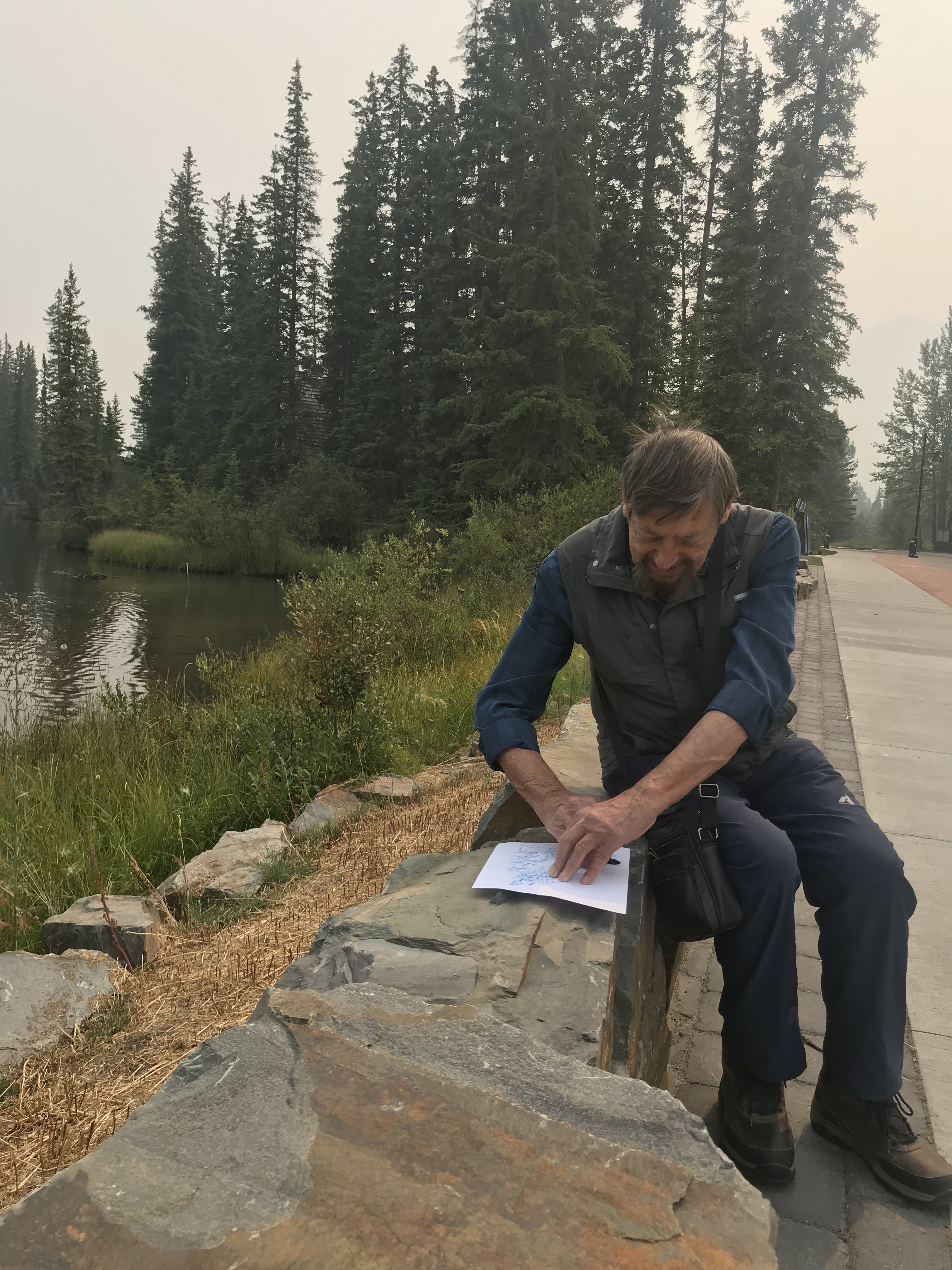
Dad at work making a crayon rubbing on the flat stones along Spring Creek. The smoke from forest fires across the BC/Alberta border was awful for most of the time he was here. 😦

Dad came out for a visit to my place in Canmore and we spent almost a week together making marks and experimenting with new mixed media techniques. One of the first things we did was head down to Policeman’s Creek and Spring Creek to do some rubbings on the big flat stones and the weathered wooden railings beside the creek.

We weren’t intending to use the rubbings by themselves, but rather as elements in another project.

IMG_6324

Crayon rubbings in Canmore, along the creek. These will become elements of other pieces.

Crayon Rubbings on Stone

Though the patterns were random, a couple of them immediately suggested natural forms – mountain ranges and river deltas. Having something to start with made a huge difference when it came time to sit down and start to work. Over the next week we layered our rubbings (done with peeled wax crayons on plain old copy paper) as backgrounds, cut them up and used them as textured layers in mixed media pieces, and then filed the extras for future projects.

Meanwhile, back at the condo, we transformed the place into a wild and wonderful (and very messy!) creation space!

IMG_6369

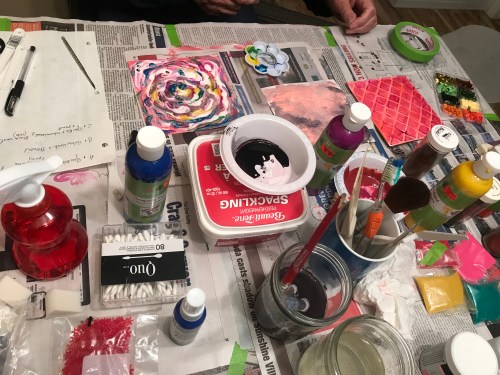
We both had several pieces going at any given time – so, when we got stuck on one (or a layer needed to dry) we just switched over to another project.

IMG_CD9E1FC599B7-1.jpeg

What we didn’t worry about was where we were going… we both just dived in (dove in?) and tried a whole bunch of stuff… Some worked, some didn’t, but along the way we thoroughly enjoyed ourselves, playing and experimenting.

55711332847__F76E6401-A8F4-4566-B14D-6568FF6FABD9.JPG

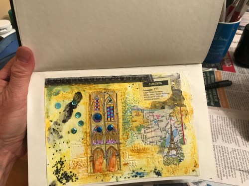
I liked the way this mixed media piece with a Paris theme was going, so I glued it onto the intimidating first page of my new sketchbook. I’ll add some text about Paris on the facing page.

Tip of the Day: Cheat

If you really can’t bring yourself to make a mark on the first page of a brand new book, create something on a piece of separate paper and then glue it in. That’s what I did with my new Art Journal/Sketchbook (see the Paris mixed media page above). And, once that first page had something on it, I was off to the races and have already filled the next several pages! Another trick is just to leave the first page blank (for now) and come back to it later. Perhaps your journal will develop a theme and then you can do a title page that suits the content several weeks (months) down the road.

Confession:

I have several journals where the first page is still blank, years after I started them.

Do you struggle with figuring out what to put on that first page? How do you overcome that block? Add a comment below – I’m always curious to hear how others deal with getting started…

Come! Join Us: Create in Provence!!

Want to come play with us and learn all kinds of tips and tricks for banishing that fear of creating something – anything – to break in that new notebook? Check out our creativity retreat in France next spring!

Monsoon June (31/365)

IMG_4371 2.JPG

After a few glorious days of sun and heat, it’s cooled right down again here as we head into Monsoon June. Rain, dipping temperatures, and really cool skies (check out those clouds!) are typical of this time of year. After a few weeks of this unpredictable weather, we head into forest fire season.

Last summer the fires were awful… thick smoke day after day and everyone on edge wondering if the flames were going to sweep through and engulf inhabited areas. Fort McMurray. Kelowna. The memories are still fresh.

mark tobey forest-fire-1956

Forest Fire, by Mark Tobey, 1956

This year’s fire season is still in the future. For now, I’m going to enjoy the beauty of clouds…

Clouds and the Baths

Puffy clouds over the Baths, BVI

Clouds over Canmore.jpg

Clouds over Canmore

Clouds over Ha Ling

Clouds over Ha Ling

Reflected Clouds - Policeman's Creek

Reflected Clouds – Policeman’s Creek, Canmore

Caribbean Clouds.jpg

Caribbean Clouds

Spanish Clouds over the Camino

Spanish Clouds over the Camino


More Spanish Clouds.JPG

More Spanish Clouds (Dawn)


More Clouds over Ha Ling

More Clouds over Ha Ling

Apparently, I have a thing for clouds… I found dozens and dozens of photos of clouds from pretty much everywhere I’ve been over the past dozen years.

Artists, too, find clouds irresistible.

OLYMPUS DIGITAL CAMERA

Cloud Study, E. Colin Williams (watercolour)

Dad has done his share of cloud-centric paintings.


o keeffe 1963sky-above-clouds-iii.jpg!Large

Sky Above Clouds III by Georgia O’Keeffe, 1963

As have many, many other painters…


Braque 1960 birds-in-the-clouds-1960.jpg!Large

Birds in the Clouds by Georges Braque, 1960


John Constable 1827 seascape-study-with-rain-cloud-1.jpg!Large

Seascape Study with Rain Clouds by John Constable, 1827


Which makes me think I need to join this cloudy party and start experimenting with some cloud-themed drawings/paintings/collages… Something. Heaven knows I have plenty of raw material to work with around here!


Memory Lane… (28/365)

Sometimes it seems that my life is a series of different digressions, fascinating side roads that are way more interesting than the whatever the main road was supposed to have been.

Those side roads are braided, looping back and around themselves like Celtic knots, leading to familiar corners rounded and re-encountered when least expected.

At the moment I’m exploring a theatre cul de sac where the familiar and the new are sending me back to the very beginning of my acting career. 


A050109 Colin Williams teaching 1970

Wow! Look what I found online in the archives of the Banff Centre! That’s Dad (holy smokes he looks so young!) in about 1970 teaching a student… (reference #A 05 01 09, no photographer listed). 


Back in 1969 when we first came to Canada from Australia we moved to Banff in the Rocky Mountains of Alberta. Dad was the first Artist in Residence at the Banff School of Fine Arts (now known as the Banff Centre for Arts and Creativity).  I was all of 8 and determined to perform my way onto the stage. I took ballet classes and enrolled in an acting class for kids. I landed a small part in a play. The director of that play and my teacher was a dynamo called Shirley Tooke.

BCA197-1602 Banff School 1970ish

The Banff School of Fine Arts (c 1970)

I’ve thought about Shirley many times over the years. She was the first person I had ever met who took theatre seriously. And, more to the point, she took me seriously, even though I had pigtails and could barely see over a table I was so short.

Imagine my surprise and delight when I ran into Shirley at the 40th Anniversary gala event hosted by Pine Tree Players the other night. Turns out Shirley has been working her magic, directing plays, mentoring actors, and making theatre happen here in the Bow Valley for decades! Everyone in the room had a connection to Shirley, a story about how instrumental she has been in terms of nurturing and developing all things theatrical around here!

BOP19700107 Hansel and Gretel

I remember going to this production of the opera, Hansel and Gretel back in 1970. We were so lucky to be able to attend performances – ballet, modern dance, opera, music (I saw Oscar Peterson live), authors (Farley Mowat comes to mind), and theatre… And, of course, art shows. I never thought much about it at the time, but how lucky were we as kids to have access to so much art in our back yard? 

It was pretty cool to see my first acting mentor from so many years ago. Though she remembered my parents (she and my dad would have crossed paths at the Banff Centre), of course Shirley didn’t remember the earnest little kid with the big dreams. But that little kid never forgot her! I’m so happy we ran into each other again and I was able to say a long overdue thank-you for the kindness, support, and enthusiasm she offered so generously.

I wish I’d had my wits about me and had someone snap a photo of us together, but I confess I was so flabbergasted it never crossed my mind to do so!

Orange You Glad… (20/365)

IMG_3885.JPG

After another morning of blood tests and follow-ups (all is well, Dad is on the mend…) Dad and I headed off to Glendale Gardens (at the Horticulture Centre of the Pacific). The man-eating rhodos are in full-bloom and putting on quite a show at the moment.

I was on a mission to find a couple of things. The first was some good examples of the color orange as that’s the Artists Magazine is looking for Instagram submissions using their #artistsnetwork_colorstory hashtag and, yes, the featured color for the next couple of months is orange.

Sparty’s dashing orange life vest made it into my notebook yesterday…

IMG_4002

The color is actually a pale impression of the real thing, which is neon crazy bright (a good thing, I suppose, if he went overboard and needed to be rescued), but I didn’t actually bring an orange pencil with me. This led to a somewhat awkward moment in the hospital waiting room when I had to ask Dad how to mix orange… He looked at me like I had just asked ‘what do I do next, I’d like to breathe…’ I know mixing colours is second nature to some, but for me, I never really got past yellow and blue make green. And so far, most of my early efforts at sketching stuff has been without colour and certainly without colour mixing…

Anyway, the answer (delivered with a minimum of eye-rolling, I suspect because Dad is not feeling his best) is red and yellow. Which, I guess, I maybe did kind of know because what else would you possibly mix to get orange?

IMG_3882.JPG
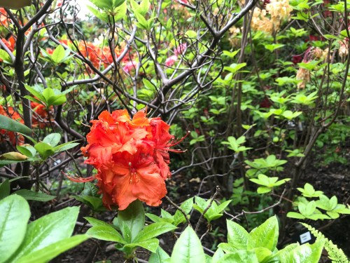
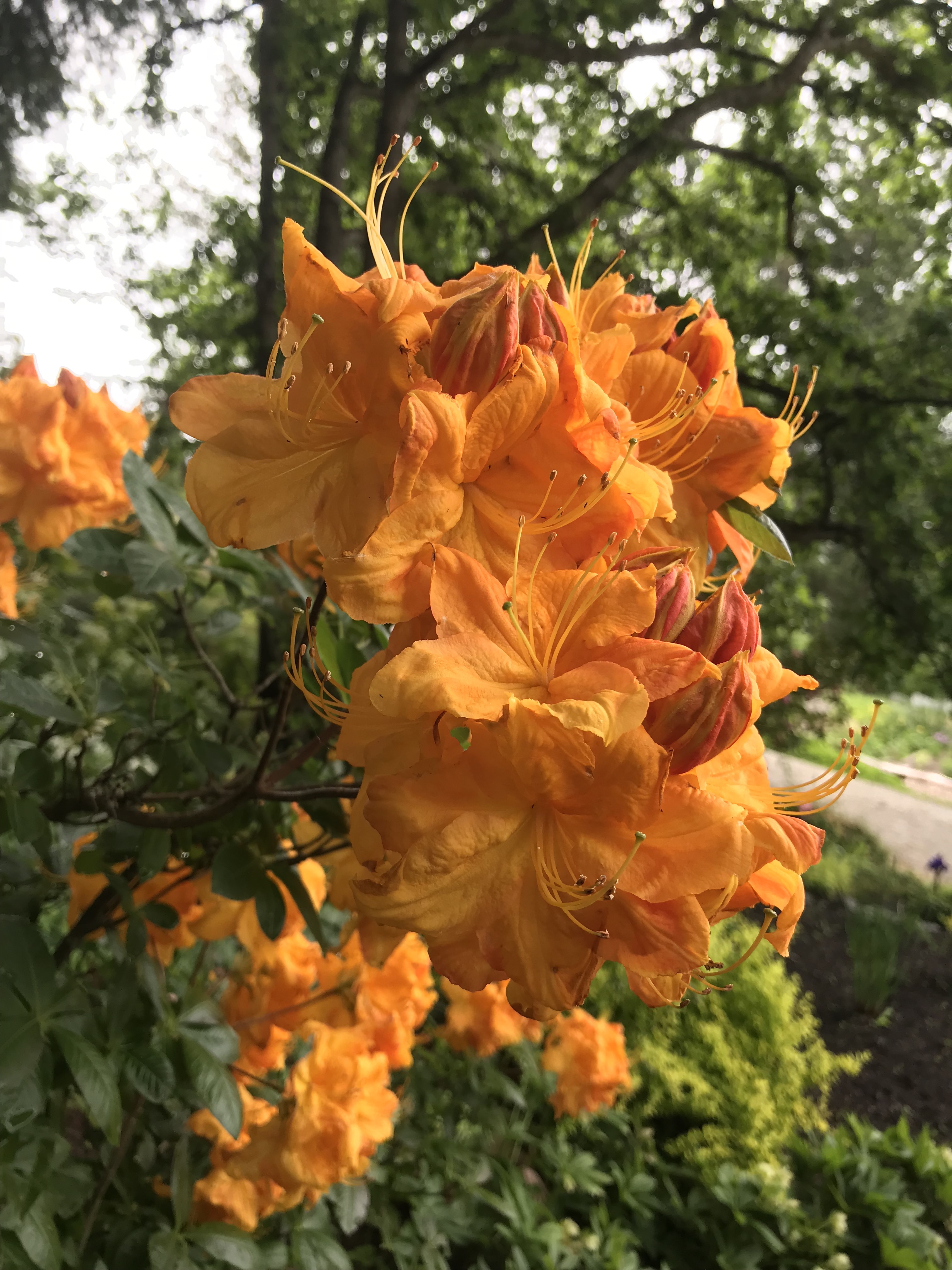
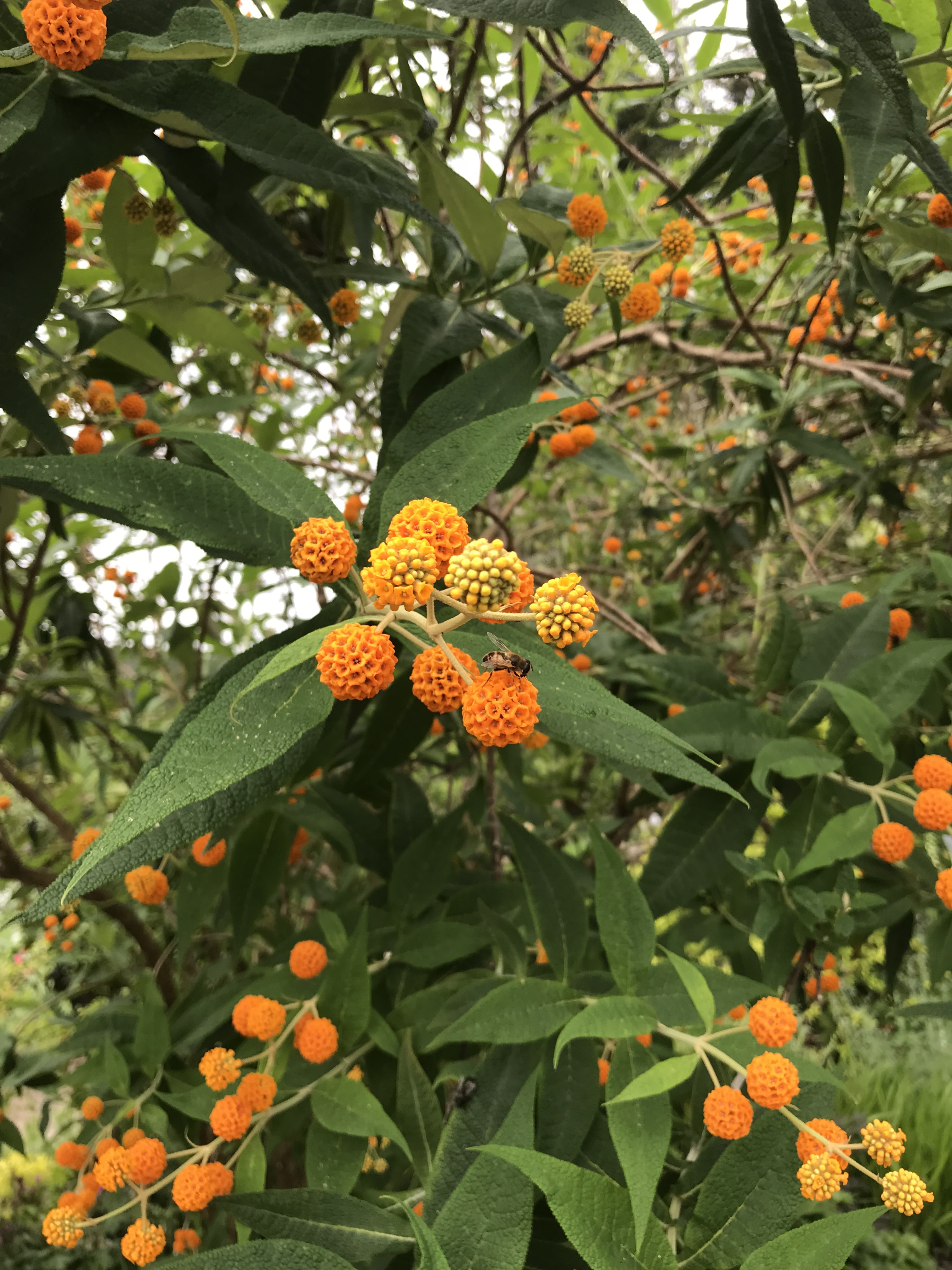
As it happens, the gardens were filled with orange-y flowers, blossoms, and blooms of all shapes and sizes (and, scents… but that’s hard to deliver via the Internet).

IMG_3876.JPGIMG_3940.JPG

Looking at those variations on the orange theme, you can see how some are more yellow, some more red… In my imagination I am swirling my paintbrush through blobs of pigment to create exactly the right mixture to capture the brilliant colors at the gardens.


IMG_3948.JPG

Perhaps my favourite orange flowers were the little balls on this aptly named “Orange Ball Tree” (did you spot the bee? they were everywhere today, which was GREAT to see)

It’s funny how, when you start looking for something, it starts showing up every time you turn around. We went to the tea shop in the gardens and what’s lying on the tea plate?


IMG_3973.JPG

Things were getting more orange by the minute… I took a series of photos of stuff on the tea table. Perhaps there may be a still life in my future? 

Even after we arrived home, the orange kept appearing!

IMG_3991.JPG


I thought this might make an interesting subject for a drawing with everything except the orange being done in either pencil or pen and wash…

Here’s a painting I found where the oranges look very yellow (though, that might be in the reproduction…)


maurice prednergast 1898 the-orange-market

The Orange Market by Maurice Prendergast (1898-ish)

How about this one by Andy Warhol?


warhol 1963 five-deaths-eleven-times-in-orange

Five Deaths Eleven Times in Orange by Andy Warhol, 1963


I must say I’m kind of excited about the possibilities when it comes to colour… Stay tuned!


Look at all Those Patterns! (14/365)


Snapseed 88

Somewhere over the Rocky Mountains

Look at all those lines and patterns! I don’t usually sit in the window seat when I fly (I prefer to be on the aisle so I can stretch my legs and escape for occasional sprints, stretches, and visits to the loo without having to crawl over sleeping seat mates). Today, though, the plane between Calgary and Vancouver was half empty, so I had a whole row to myself and wound up looking out the window a lot.


Dad has always said that learning to draw begins with learning how to see. Everything (the landscape, a coffee cup, a person’s face, a hummingbird) can be broken down into visual elements – line, pattern, colour, etc.).

IMG_1417.JPG

Somewhere over an airport carpet


Snapseed 89.jpg

Somewhere in my notebook… (taking inspiration from both mountain range and carpet and somehow resembling neither…)

Dad, meanwhile, sent me some info on the German painter Josef Albers. Albers was obsessed with shapes, patterns and colour…


1976-7-49

Brackish Water Biarritz VIII, 1929 by Josef Albers (Collage)

One of his best known series of paintings (aptly named Homage to the Square) features squares…


homage-to-the-square-1967-1 Albers

Homage to the Square, 1967 by Josef Albers

Various squares in all manner of color combinations and proportions occupied his painterly efforts for nearly 30 years! Using squares in his compositions, Albers experimented (endlessly) with the ways in which colours interacted depending on their placement next to each other.

Speaking of colour combinations of note, some Canadians may recall the fuss that was kicked up when the National Gallery purchased Voice of Fire by the American painter Barnett Newman.

Barnett Newman 1967 voice-of-fire-1967

In the early ’90s the National Gallery picked up Newman’s blue, red, blue painting for a cool 1.76 million dollars. Granted, it’s a pretty large piece (18′ tall), but you can imagine detractors squawked. Not only was this a piece of work that generated some head-scratching (blue-red-blue? that’s it?), it was painted by an American!! Shouldn’t Canadian taxpayer money at least be used to purchase Canadian art? [Note, I am merely paraphrasing the discussion at the time… don’t throw things at me…]


In a 2014 Ottawa Citizen article by Peter Simpson, some rather crazy numbers get tossed around. At that time the Newman painting was estimated to be worth more than $40 million USD! Perhaps the rash purchase back in the day was actually a pretty smart investment. Not that public galleries buy art primarily as an investment, but it is nice to know that sometimes the curators get it right.

Perhaps I need to do an 18′ high version of my dot…