Tag Archives: drawing

Look at all Those Patterns! (14/365)


Snapseed 88

Somewhere over the Rocky Mountains

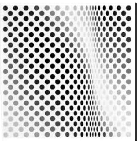
Look at all those lines and patterns! I don’t usually sit in the window seat when I fly (I prefer to be on the aisle so I can stretch my legs and escape for occasional sprints, stretches, and visits to the loo without having to crawl over sleeping seat mates). Today, though, the plane between Calgary and Vancouver was half empty, so I had a whole row to myself and wound up looking out the window a lot.


Dad has always said that learning to draw begins with learning how to see. Everything (the landscape, a coffee cup, a person’s face, a hummingbird) can be broken down into visual elements – line, pattern, colour, etc.).

IMG_1417.JPG

Somewhere over an airport carpet


Snapseed 89.jpg

Somewhere in my notebook… (taking inspiration from both mountain range and carpet and somehow resembling neither…)

Dad, meanwhile, sent me some info on the German painter Josef Albers. Albers was obsessed with shapes, patterns and colour…


1976-7-49

Brackish Water Biarritz VIII, 1929 by Josef Albers (Collage)

One of his best known series of paintings (aptly named Homage to the Square) features squares…


homage-to-the-square-1967-1 Albers

Homage to the Square, 1967 by Josef Albers

Various squares in all manner of color combinations and proportions occupied his painterly efforts for nearly 30 years! Using squares in his compositions, Albers experimented (endlessly) with the ways in which colours interacted depending on their placement next to each other.

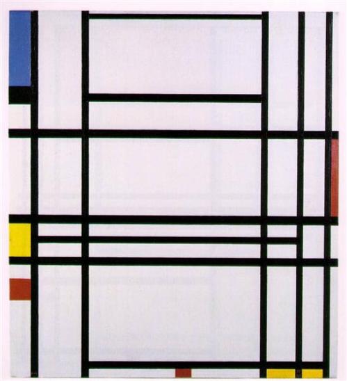
Speaking of colour combinations of note, some Canadians may recall the fuss that was kicked up when the National Gallery purchased Voice of Fire by the American painter Barnett Newman.

Barnett Newman 1967 voice-of-fire-1967

In the early ’90s the National Gallery picked up Newman’s blue, red, blue painting for a cool 1.76 million dollars. Granted, it’s a pretty large piece (18′ tall), but you can imagine detractors squawked. Not only was this a piece of work that generated some head-scratching (blue-red-blue? that’s it?), it was painted by an American!! Shouldn’t Canadian taxpayer money at least be used to purchase Canadian art? [Note, I am merely paraphrasing the discussion at the time… don’t throw things at me…]


In a 2014 Ottawa Citizen article by Peter Simpson, some rather crazy numbers get tossed around. At that time the Newman painting was estimated to be worth more than $40 million USD! Perhaps the rash purchase back in the day was actually a pretty smart investment. Not that public galleries buy art primarily as an investment, but it is nice to know that sometimes the curators get it right.

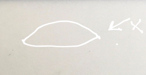
Perhaps I need to do an 18′ high version of my dot…


Dots, Lines and 3D (13/365)

FullSizeRender 2

Back to Basics: Red Dot, Green Line (pen and gouache)

Yesterday I left off with the thought that if lines and circles were a bit much to handle, perhaps I should have a better look at the good old dot.

Then Dad sent me this…

IMG_3222

Pause, by Bridget Riley (1964)

Oh boy. I’d say mine is more… colourful? Clearly I have a lot to learn about dots. Bridget Riley was born in England in 1931 and became one of the big names in the Op Art movement. She was also the first woman to win (in 1968) the painting prize at the Venice Biennale. (More about her here.)

Dad was not done with lines, though… and also sent this:

IMG_3219

Thankfully, he also sent an explanatory comment about the Golden Section which was, apparently, the point of the series of boxes. I’ll try to explain in case you aren’t right up on your geometry. Top left – a square. Kind of boring. (I’m paraphrasing Dad here… there were a series of texts and then a lengthy phonecall before I got this all straight in my head). Next box – a square cut in half. Also kind of boring. Next up, a square cut in half in the other direction. Also not so interesting. Then, bisected squares bisected to make smaller squares. Ho-hum. And then, in the bottom row, things get interesting.

Basically, you take a square and bisect it (see bottom row, square on the left). Take the diagonal of one of the halves. Add that distance to the bottom line of the square on the left… the resulting rectangle (I’ve added some red lines to my version below) is roughly 1.65: 1 (length to height) ratio.


IMG_3223.JPG

Golden Ratio (more or less)


Mine isn’t super accurate as I didn’t use a compass or set square, so my measurements are not quite right, but you get the idea. Anyway, that basic rectangle in those proportions pops up over and over again in architecture dating back to those clever ancient Greeks. Even before that, the ratio appears in snail shells and the way in which the spiral pattern is formed in the seeds of a sunflower head. Those complex examples are waaaaaaaay beyond my capacity to draw, but the basic principle of the ratio remains the same.

Unrelated to the Golden Ratio, I was also determined to have a look at basic three dimensional shapes…

IMG_3218

The boxes are a bit wobbly and the one on the table top/flat surface to the right is all wrong as the two surfaces are on two different, incompatable planes… Which led us into a discussion about perspective that was accompanied by another flurry of diagrams from Dad. Which will have to wait until tomorrow as those messages spun off into a discussion of perspective, various other artists, primary colours, and art-themed movies not to be missed…


Lines (12/365)

The lines seemed to go a little better than the wobbly circles of yesterday… with the exception of trying to draw a square using a series of parallel diagonal lines. That was so not happening, especially when the lines angled down and to the right… clearly some neurological rewriting needs to happen before I get that right. My triangles are a bit asymmetrical and my straight, vertical lines all tend to have a bit of a leftward leaning tilt, but overall today’s exercise was not quite as painful as my efforts yesterday.

Mondrian Piet 1940 ish composition-no-10-1942

Composition No. 10, Piet Mondrian (1940-ish)

Piet Mondrian jumps to mind when I think of nice straight lines put to good use. What I didn’t expect was to see Van Gogh popping up in the Getty Museum’s handout intended for students learning about the elements of art. Line, of course, is one of those basic elements…


Van Gogh wheat-field-with-sheaves-and-arles-in-the-background-1888

Wheat Field with Sheaves and Arles in the Background, 1888 by Vincent van Gogh 


Check out all those lines!! There’s no real drawing going on here, per se… and yet… That’s a wheat field! And smoke from the factory chimneys! And stubble… and the impression of a real place made up of a bunch of short lines! Here’s a link to the handout, in case you want to have a go at filling in all the boxes with different types of lines.

I confess I was inspired and decided to give the line-making another go, this time based on the little boxes on the Getty handout…

More lines IMG_0189

It’s no wheat field, no Arles, but I can see how mastering some of these basic elements could prove useful someday.

Dad concurs. Right under the greeting ‘Happy Mother’s Day’ he texted, “Lines are really neat…” and then went on to illustrate with some quick examples. They were a little different to the Getty categories… Dad’s examples were:

  1. static straight lines
  2. straight lines showing slight movement
  3. more interesting/complex movement, still using only straight line
  4. quite a complex pattern, though not using many more lines (just varying length, angle, relative positions). Here’s my rendition of Dad’s example…

IMG_4504

No wonder I was having such trouble with circles! I was running before I could walk… I’m thinking maybe tomorrow I need to go back a step farther and maybe try a plain dot. I’d ask, ‘How hard could that be?’ but I am thinking even a dot could present mysterious challenges I can’t even imagine…

Take the Lowly Circle (11/365)

If you’ve been reading along for a while you will know I’ve long been hankering to up my game in the visual art department. Ok, more accurately, to have any sort of game at all. They say you need to start somewhere, so today I pulled out paper and pencil and tried to draw a circle.

My. God.

How hard could that possibly be? Hard!!

But if one masters the skill of the perfect freehand circle, one could go down in history. Like Giotto, the Italian painter who could, according to artistic legend, draw such a perfect circle it seemed he had used a compass.


This is a mural designed by Dad (shown here in progress) down in Ottawa, Illinois. One of Ottawa’s claims to fame is a glass factory where they made marbles (that’s a giant marble in the middle).


When I mentioned to Dad I was attempting to draw (in general, circles in particular) he immediately mentioned the ‘perfect O of Giotto.’ How could I not have known of this guy’s special talent before now?


APC Patrol Cyprus (1974) by E. Colin Williams (Note: circle turned ellipsis when viewed from an angle… I guess practicing my circles isn’t just a lame exercise…)


Giotto, turns out, didn’t just draw endless circles (though he must have drawn a few in his day to get so good). Though exactly who did what is hotly debated in art historian circles, this one is most likely Giotto’s work.


giotto st-paul.jpg

St. Paul (late 1200s) by Giotto di Bondone (Giotto)


One of my favourite factoids about the painter was discovered after an analysis of his front teeth upon his death. Apparently, they were worn away in a way that indicated he had spent a lot of time clenching a paintbrush between his front teeth!


Gerrit Dou 1630 35 the-extraction-of-tooth-1635.

Extraction of a Tooth by Gerrit Dou, 1630-ish


Note to self: if I ever dare to touch a paintbrush (after today’s painful experience with a pencil and a circle, I’m not sure I’ll ever get there), I will be sure to put it down when it’s not in use!! I need my teeth!!


Alberta Schoolhouse Doorknob by E. Colin Wiliams  (Here’s another painting by Dad, this one featuring several pretty good circles…)


Dad’s hot circle tip: Practice!! And… ellipses are more difficult. People think they are pointy at the ends…


Dad sent this helpful illustration of what not to do in the ellipsis department…


Keep on drawing!! See you tomorrow…

Dad Draws a Tree

For as long as I can remember, I have loved to watch my father draw. It has always seemed to be somewhat miraculous the way images somehow seep out of the tip of his pencil (or flow from the brushes) and onto the page (or canvas). Because Dad will be recording his impressions of the Camino trip visually, we have been talking a lot recently about the artistic process and how he will capture his experience of the trip through his art.

We’ve decided to make a series of videos about Dad and his work – where he gets his ideas, how he ‘trains’ for a new project (more about that in a future post), and then how he gets what’s in his head onto the page. This first, short video (about two minutes long) shows him drawing a tree. Simple. But we wanted to set up the camera and do a test before we launch into anything more complicated. I have watched it several times now and still find it just as fascinating to see a tree appear from nothing as I did when I watched, captivated as he drew or painted something marvelous when I was a little girl.

patreon-logo

Enjoy the blog? Consider becoming a patron to support the creation of these blog posts, photo essays, and short videos. In return, you’ll have my undying appreciation, but you’ll also get access to Patron-only content, advance peeks at works in progress, and more – all for as little as a buck a month! It’s easy – head on over to Patreon to have a look at how it all works.